Crafting a Cryptocurrency Exchange Platform
Process and challenges on creating a seamless and feel-natural experience in a Maltese blockchain startup

Curiosity. The first feeling that struck me when I start working on this project that, in the first glimpse, was so different from my past work experiences. This feeling was exactly what was needed to engage in such a challenging project and craft an interface that was a result of a rich and complex flow of thoughts.
1. Project
The primary concept of brand and product is Freedom. Freedom to exchange however and with whoever you want. This is deeply interlaced with the easy UI requirement. After all, if it’s about freedom is about making it accessible to everyone to use in any context.
The goal for the UI was to provide an easy and seamless experience to buy or sell a cryptocurrency, as conveying a simple task. Not for financial experts or pro traders but for everyone who wants to do that.
Blockchain is a trending topic but also involved in a mysterious mist, sometimes related to a high techie or too disruptive things. Truth being said, blockchain as a structure is anything but simple, but its concept is, decentralization, democratize it’s value to people. And, I truly believe in order to do that, it’s usage and understanding should be simple, reachable. Not as the stock market, but more as an intuitive digital bank.
Crypto UIs probably will influence a lot on how successful the concept of digital currency will be. It must matter to people, it must provide a daily benefit that would engage people in adopting that. Without a digital seamless and fluid experience, it starts lacking on the starting line. The manifest is great sure, decentralize currency, but no idealist aura would be sole success ingredient to convince people.
2. Process
It starts by making a lot of questions without assuming anything. The cryptocurrency was a very new topic for me, so naturally starts with a process of unrevealing this brave new world. In the other hand, proved to be the ideal project to use my knowledge from projects in a different context but somehow similar user needs and requirements. That gave me some fresh new (and why not, lain) eye that proved to be helpful in understanding how we could convey user-friendly solutions to users that aren’t expert traders or financial apps hard users.
Going back and forward in screen creation was sometimes easy to get lost in topics and consistency but mostly if we were attending the user needs. So the user journey was the approach taken to understand this big and complex structure as an ideation tool but also as a reference guide to understand the how and why’s necessary to convey the user-friendly approach longed for in the project. So, each critical user scenario was mapped step by step describing the context, user’s motivations, needs, and pain points. As the project kept on moving, guerrilla testing was conducted and the user journey description was becoming more and more relevant to understand the possible solution and insights.

Collaborative Ownership
Each project experience, unique in its own particular way. One thing that right away felt very different from my previous work experiences was that there were no clear boundaries between UI creation work and implementation. Intertwined, creation and coding, proved to be a more efficient method to rapidly create, test and deploy blocks of UI that bit by bit assembles the whole product. Collaborative ownership instead of setting boundaries between members of the team divided by specialties.
3. Product
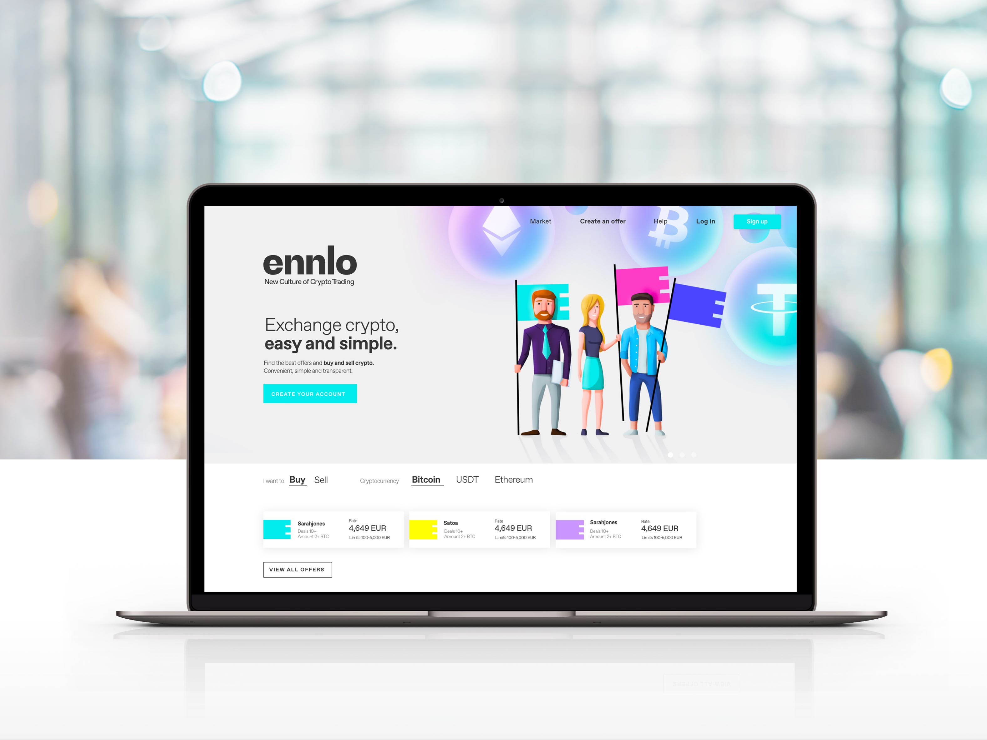
A financial product that doesn’t look like a financial product. The opportunity to disrupt conventional UI guidelines in financial apps is, to say the least, thrilling. The freedom concept meant for the creative team that the product must allow simple and easy interactions with straightforward communication. Not trying to follow other cryptocurrencies exchange platforms that look anything but friendly and simple rather technical and complicated.
Guidance, Simple and clear information.
Don’t assume the user would know something about anything. We opt to provide big text that explains details but in a simple way. Why? Well, the product innovative aspect, a cryptocurrency peer-to-peer platform, leads to a simple and inevitable conclusion: this is NOT intuitive. Intuitive means, in simple terms, conscious reasoning and instinctive understanding. This relates a lot to background knowledge about stuff, familiarity. Since we are dealing with some really new stuff (especially the crypto trading part) for our intended users, newbie trader, intuitiveness is definitely not in our side. Therefore, usage of references and a text that would clearly indicate next action was the approach choose to make the actions as natural as possible given circumstances. No technical charts or flow of assets made visual, a simple black on white text to inform what user must know, and nothing more.


Breaking down complexity
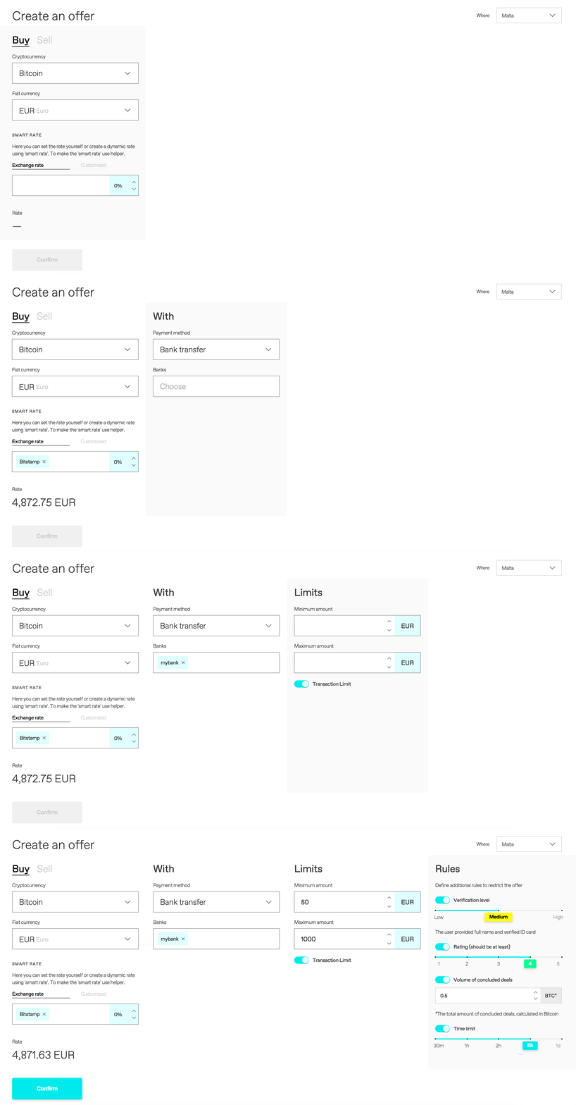
There are some interactions in the product that contains a lot of content and with that, complexity. The main example is the Create an Offer page, a critical interaction since this action will basically add content to the platform in its market page. Without user creating offers, the product will lack its more relevant piece. In addition to that, the process is not very simple if you consider alone the number of parameters user must set. So, our approach towards that was to break interactions in well-defined parts: Buy or Sell / What / How / Amount and Rules (optional)

The story we want to tell
With the birth of a digital product, a story starts a co-creative story between users and developers. It unfolds as users engage in actions and connects to what is ultimately relevant for him (check my another article about this) so there is value, and product evolves, written by developers. Going deeper in the story playful concept, it’s accurate to say that this story main plot is people trading cryptocurrency between themselves, and we have stages to back this up (pages like market, create an offer and trading pages). But, to make things more interesting, we chosen to create a subplot towards this main one. That is, establish a crypto-community, and for this, we had to provide other stages enabling the enhancement of this part as the story continues and hopefully leading to other more complex and interesting stages and plots.
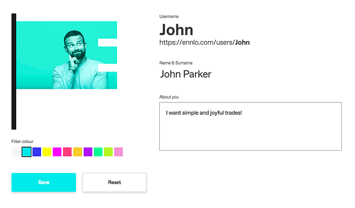
The stage for the subplot mentioned is the user profile page. The flag represents the trader’s identity in community, and the user can personalize his “own flag” with his desired avatar and filters colors. This then will be his flag, distinguished from other traders, this is how he would appear in market and trading pages.

Check the full product in ennlo.com
